Tilt Shift, Blend Modes, and the Necronomicon
When I began developing the level for In a Plaza Darkly, I knew I wanted it to be visually darker than what I've done previously. After all, it says "darkly" right there in the title.
Darker, yes, but also colorful — this wasn't going to be some shadowy survival horror game. It needed to also keep the neon look of the other levels.
Back when I was working on Atomize, I stumbled on the Tilt Shift effect in pmndrs/postprocessing, and ended up using it for the whole level. But not in the normal way.
As you may know, normally a tilt shift effect blurs a portion of the top and bottom of an image, fading to an unblurred section around the middle. It can be used to mimic the look of small-scale, miniature photography.
But things get really interesting when you play around with the blend mode options pmndrs/postprocessing gives you. On Atomize, I used color dodge to give deeper shadows and a slight haze to the scene. Towards the end of the song, I switch to linear light to give the ending a super saturated, neon feel. In both cases the opacity of the effect was set to 50%.
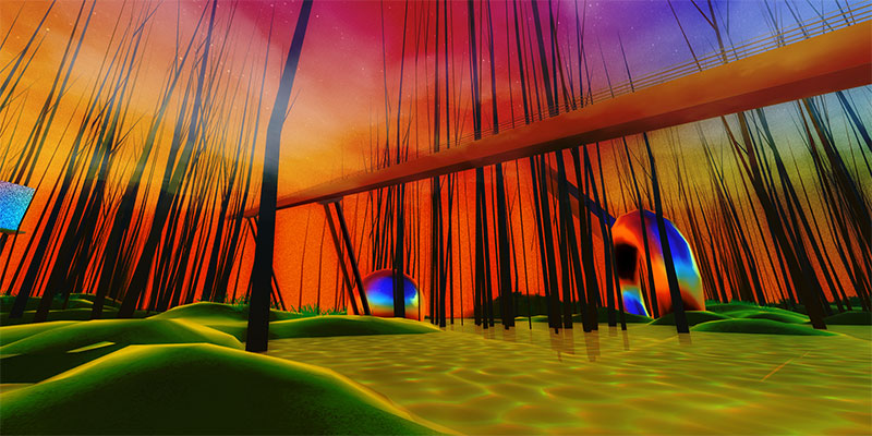
Early in development of In a Plaza Darkly, I set the blend mode to color burn and raised the opacity to 75%. Things got dark. But colors still stood out.
More interestingly - the blending gives darker areas of the screen a ghostly aura, almost a chiaroscuro. Notice how the edges of the trees darken the lighter parts of the sky. It's almost like a drunken ambient occlusion.

It also reminds me of practical effects found in movies from the 1970s and 1980s, where compositing gave layered objects a slightly blurry, dark halo. Look at the edges of the composited Necronomicon as it moves over the background layer in this clip from the opening of Evil Dead 2, and compare to the aura surrounding the cube precipitation:
There are lots of other applications for this method — pmndrs/postprocessing lists dozens of different blend modes. If you want to play around with my level and try different blend modes, load it up with the #debug hashtag! Click the Controls panel in the top right and scroll down to the Tilt Shift panel to expand it. You can select a different blendFunction and slide around the opacity setting.
Bonus: you get to see how convoluted and messy my debug panel is while I'm building a level.